
_conveni (バーコンビニ)VI計画 サイン計画
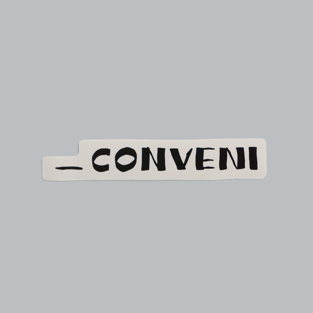
_conveni (バーコンビニ)VI計画 サイン計画
2025-10-15
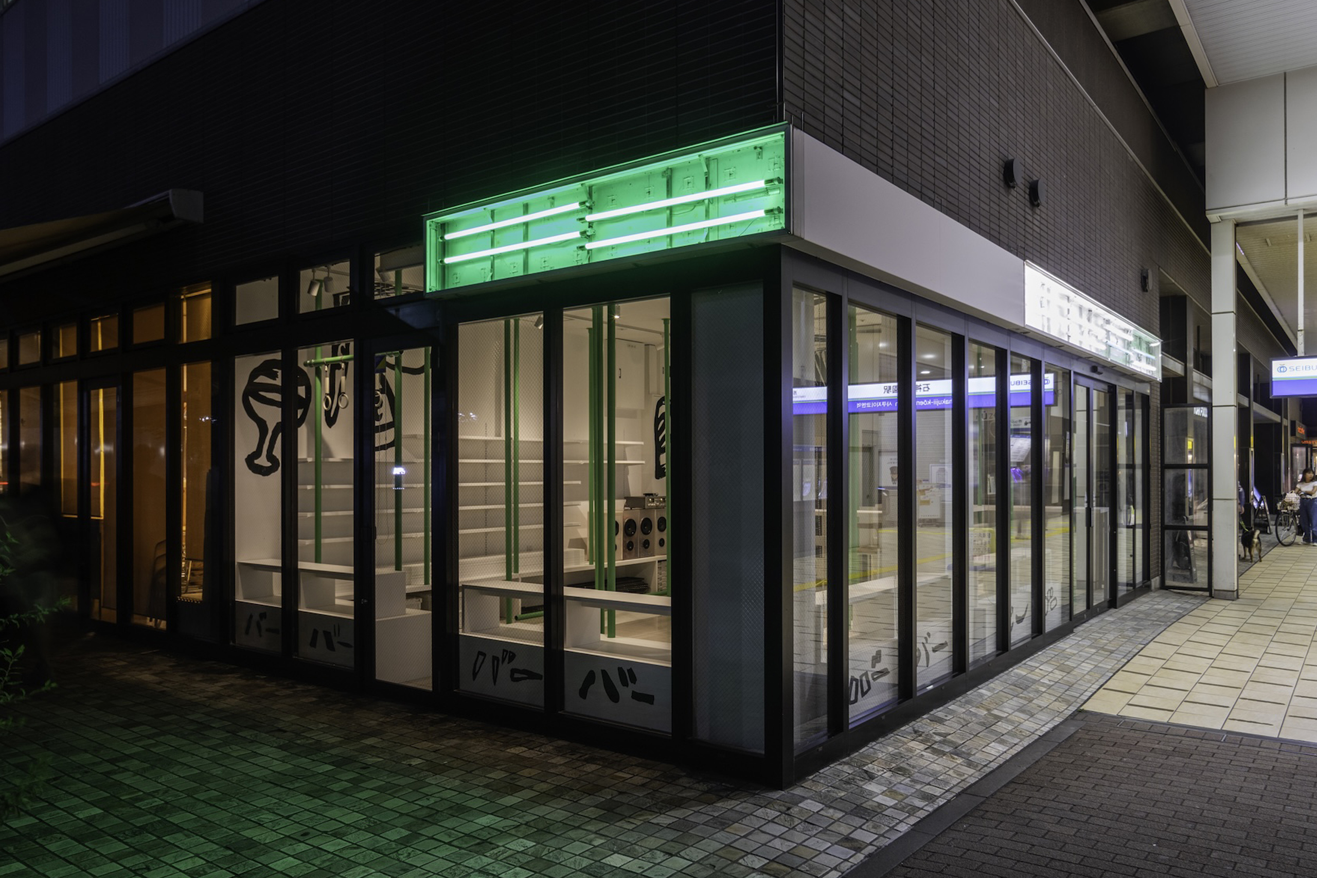
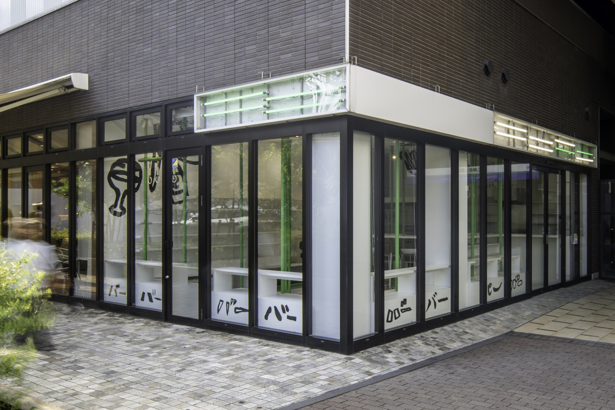
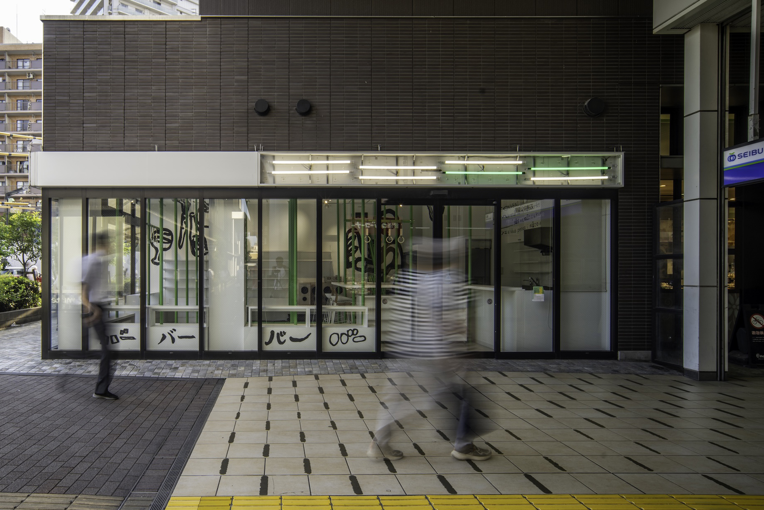
西武池袋線石神井公園駅西口改札から徒歩3秒。地域の_が買えるお店。
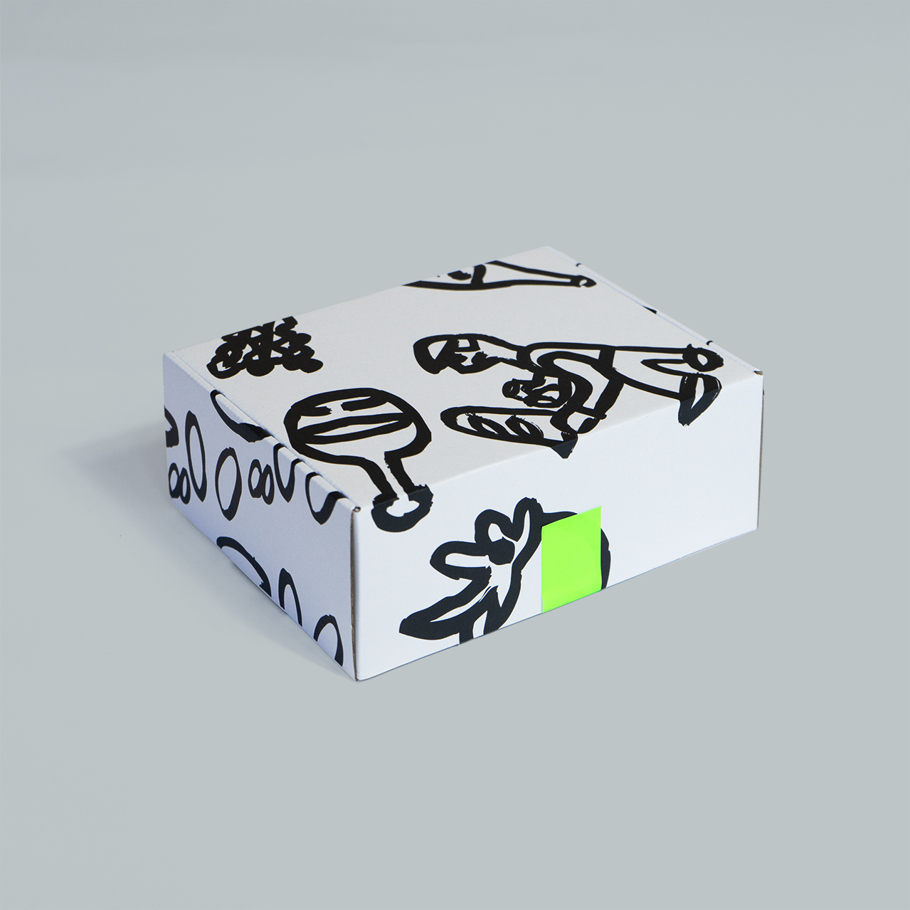
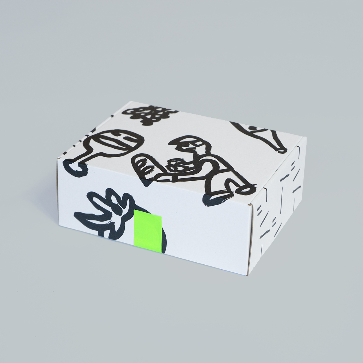
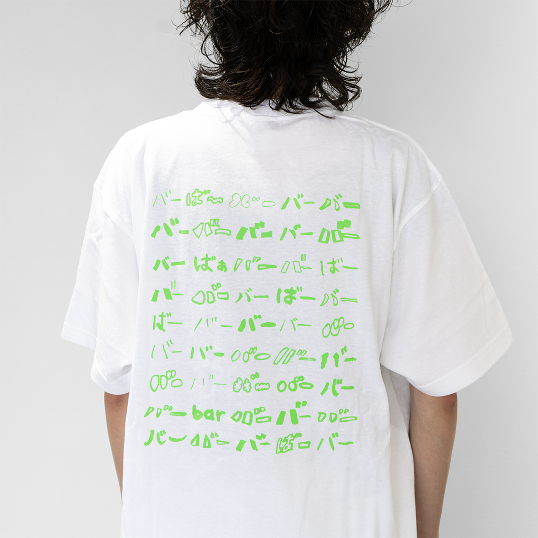
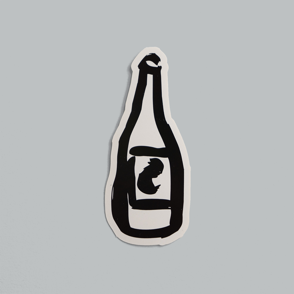
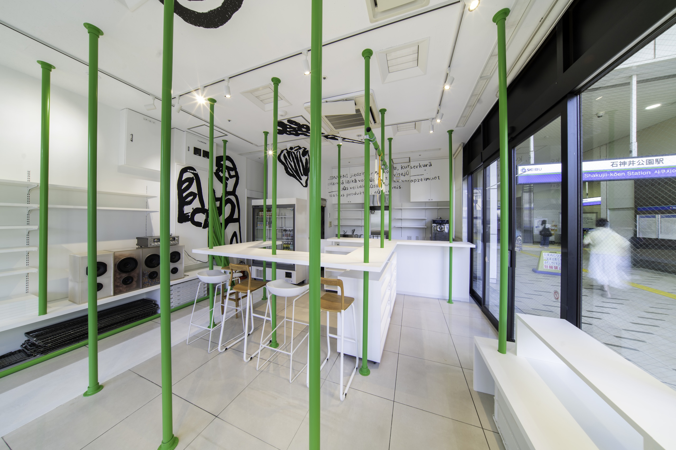
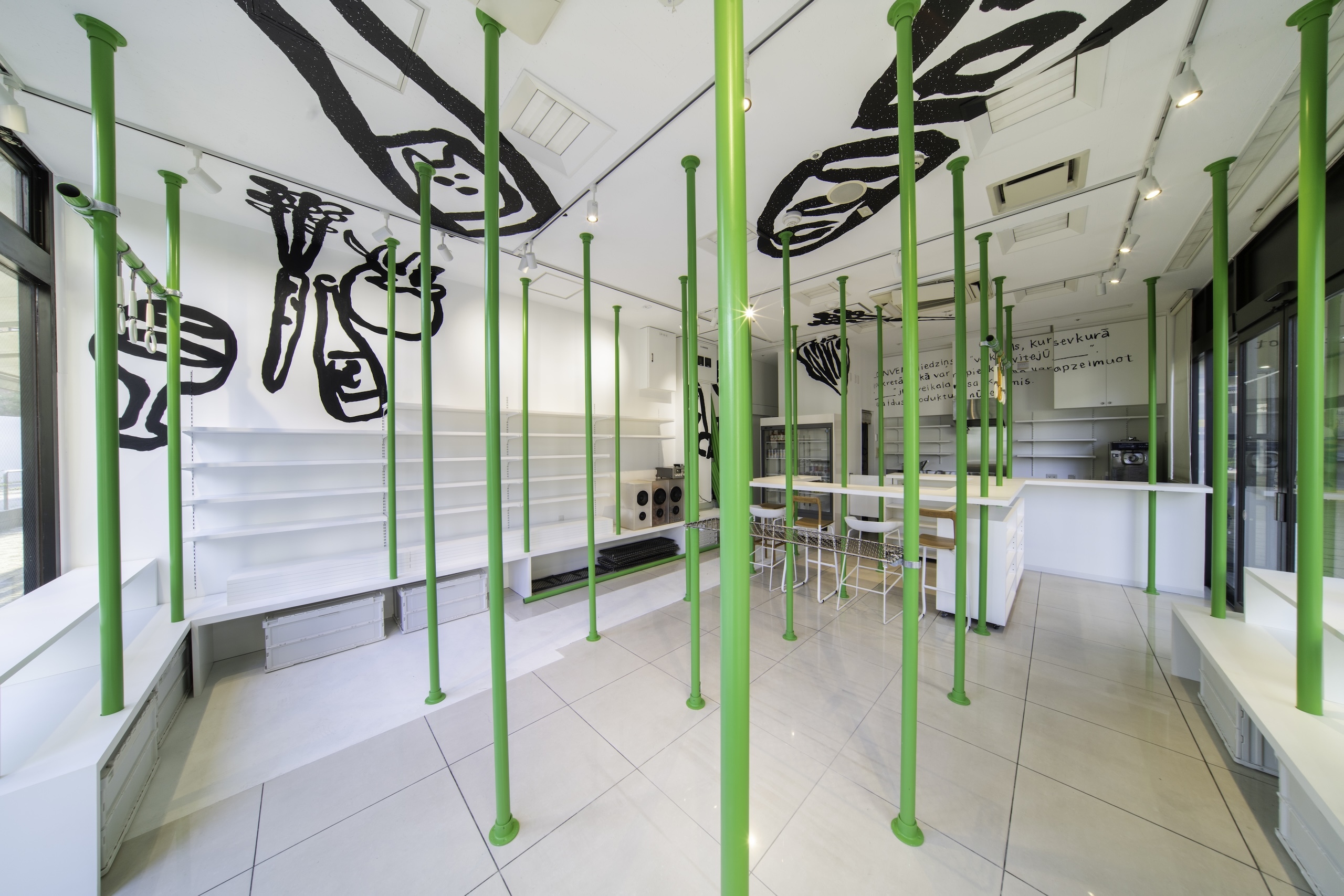
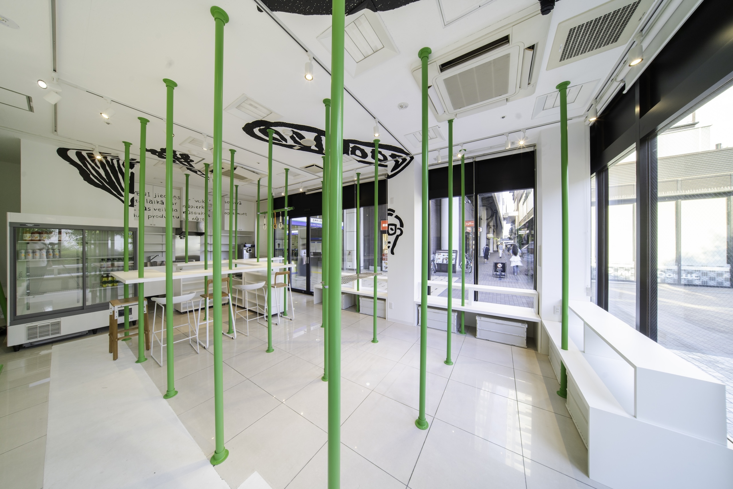
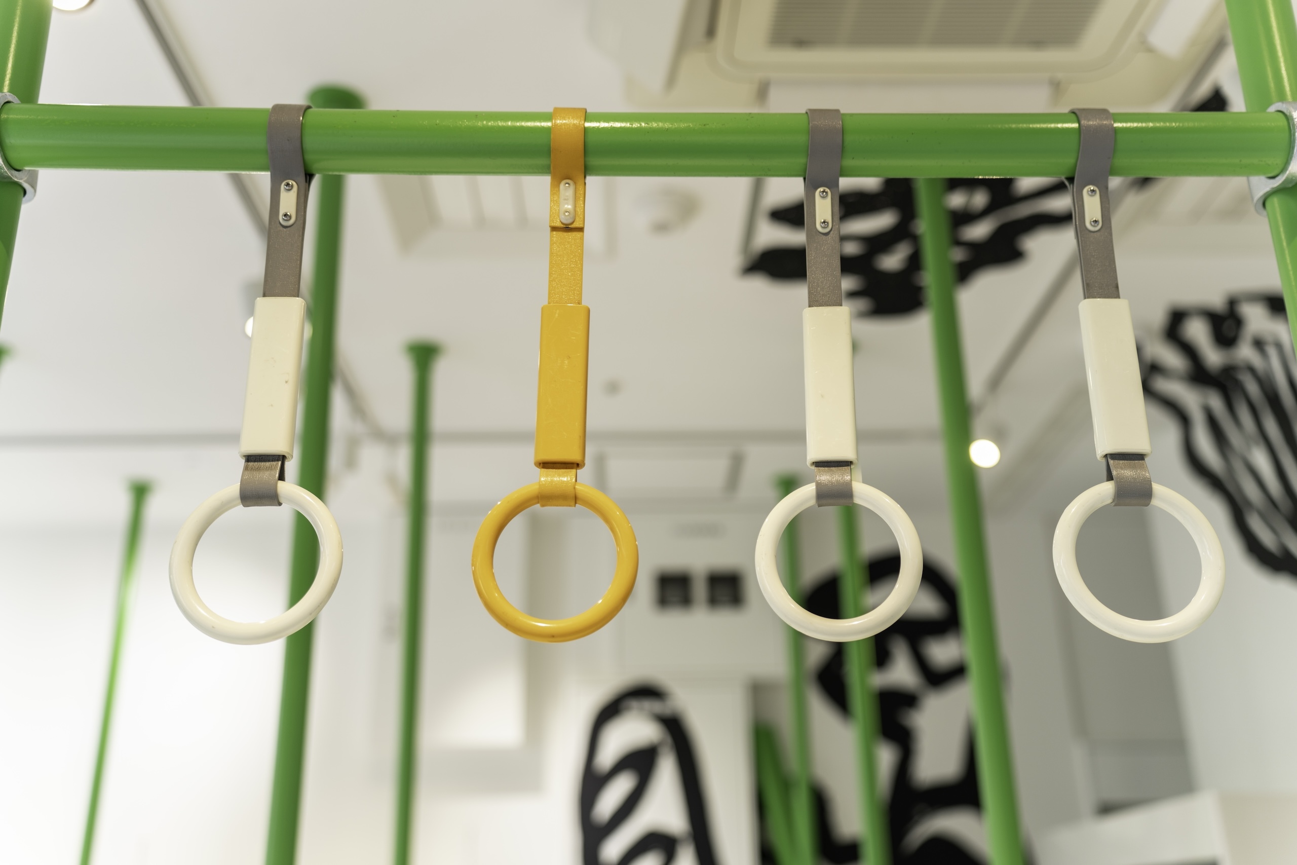
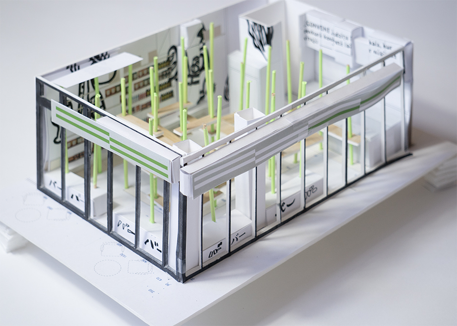
VI計画として、バーコンビニという名前から、まず、蛍光のグリーンのバー(線)を思いつきました。
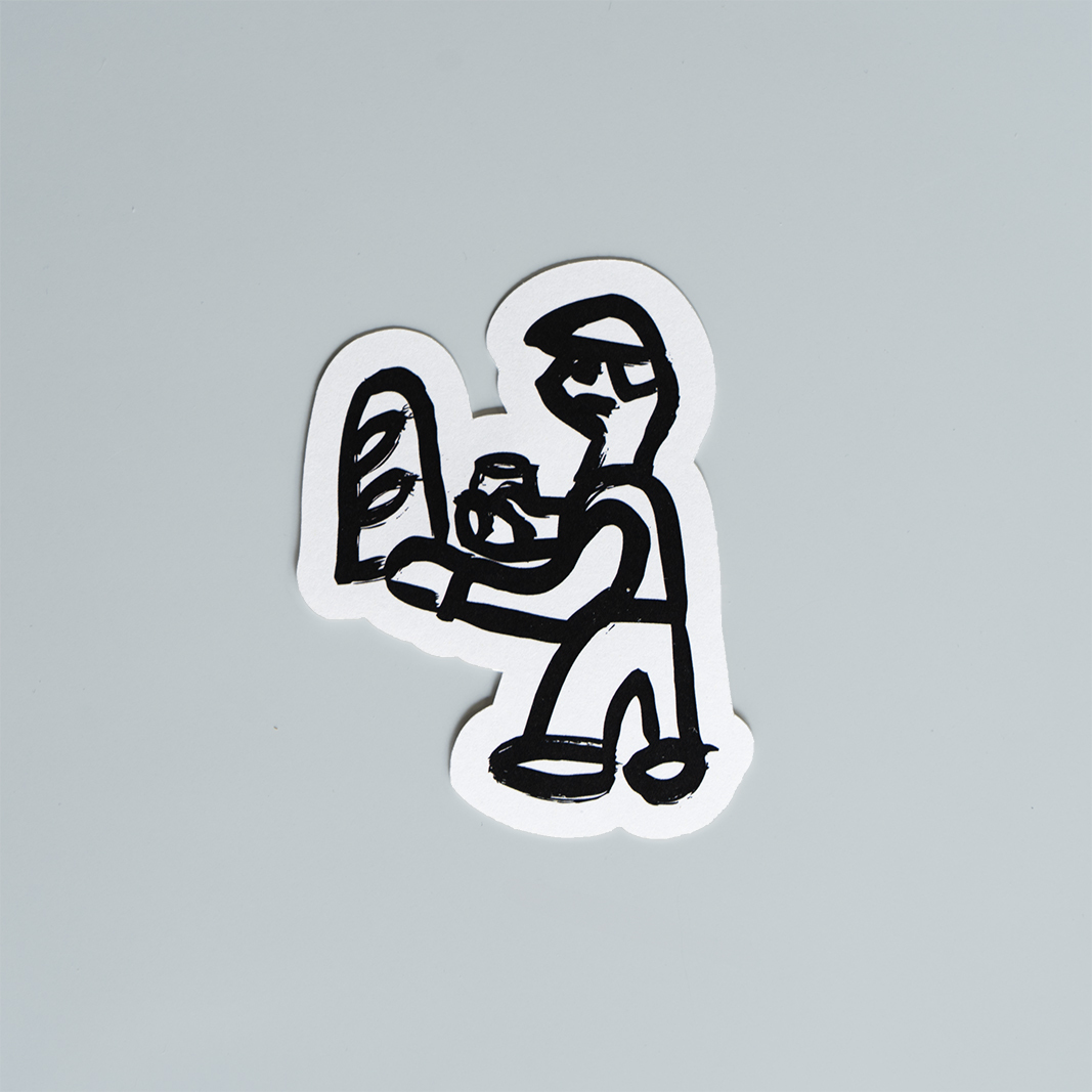
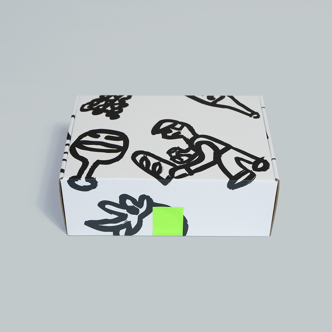
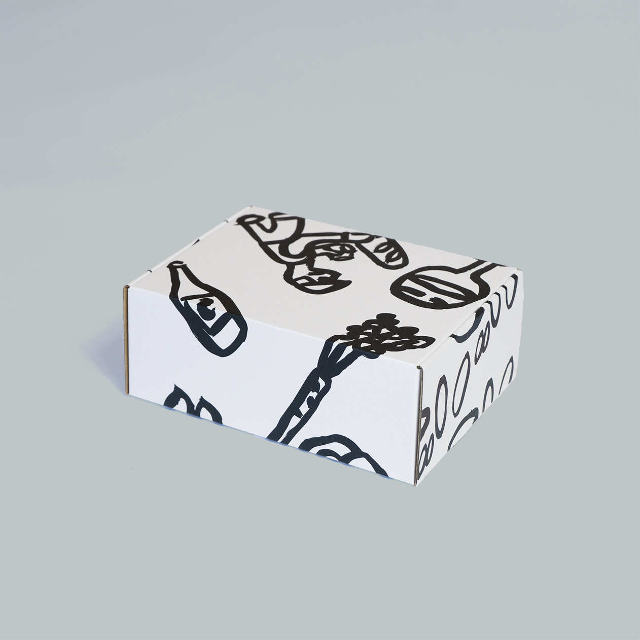
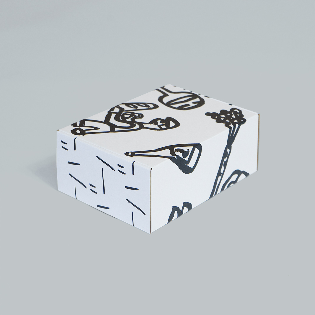
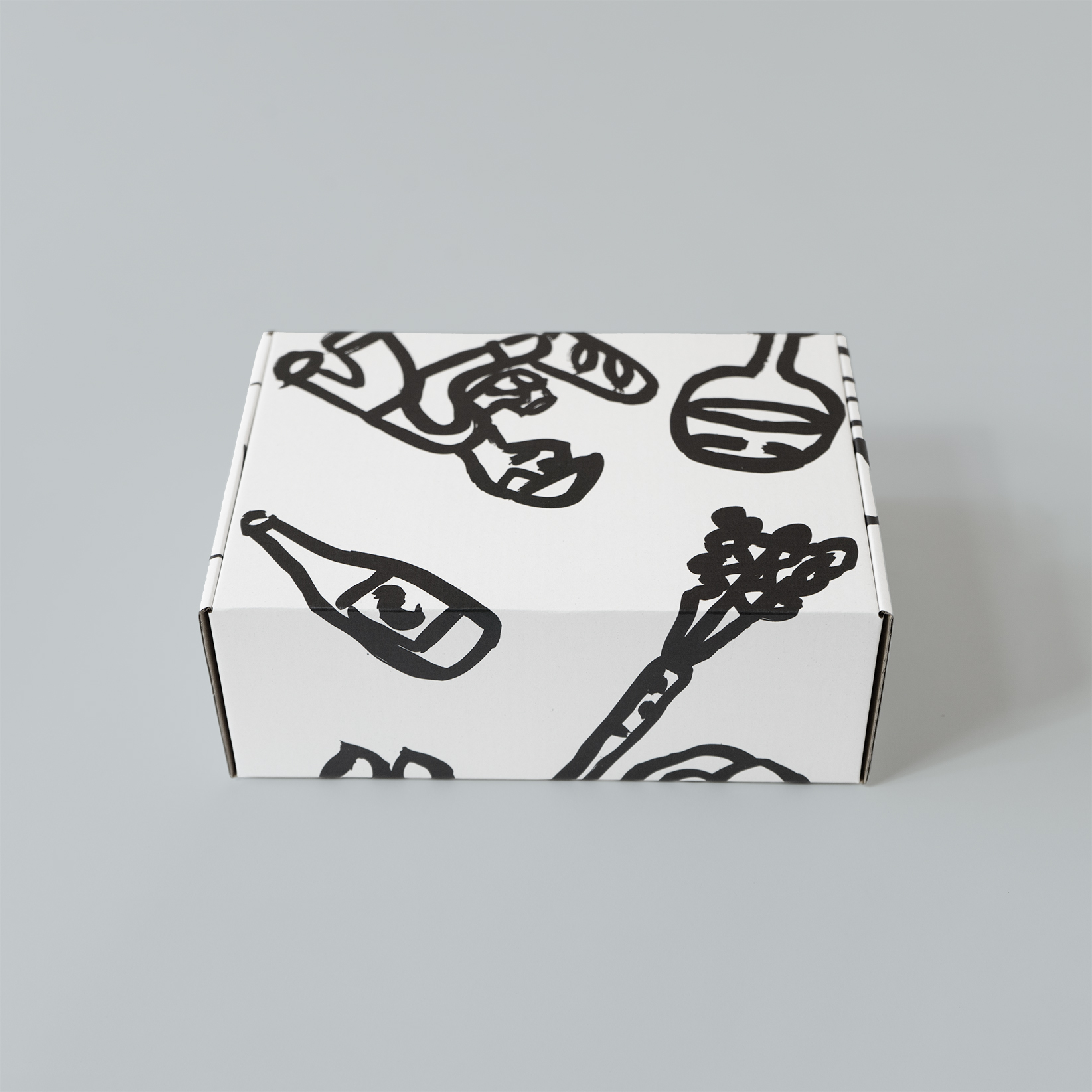
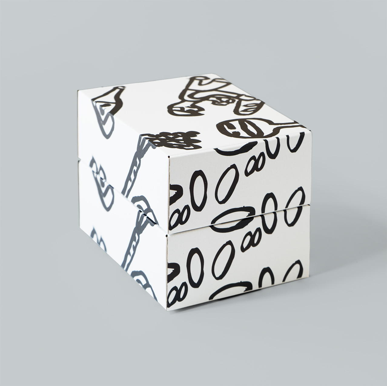
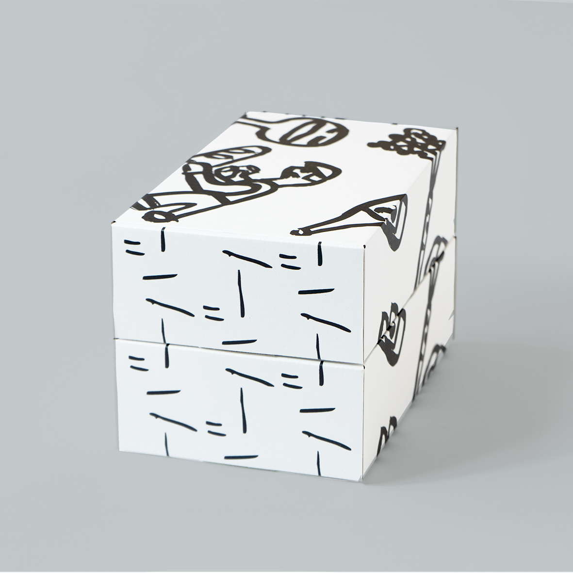
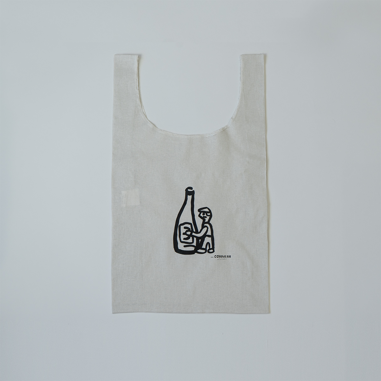
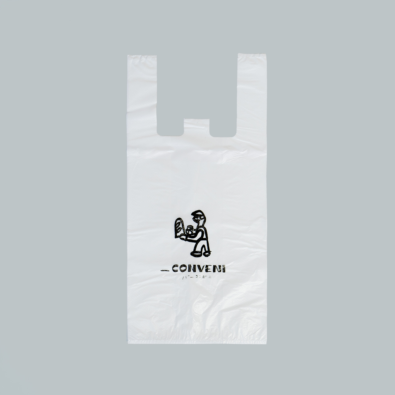
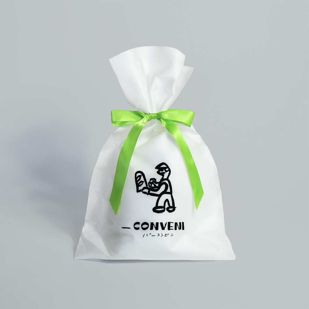
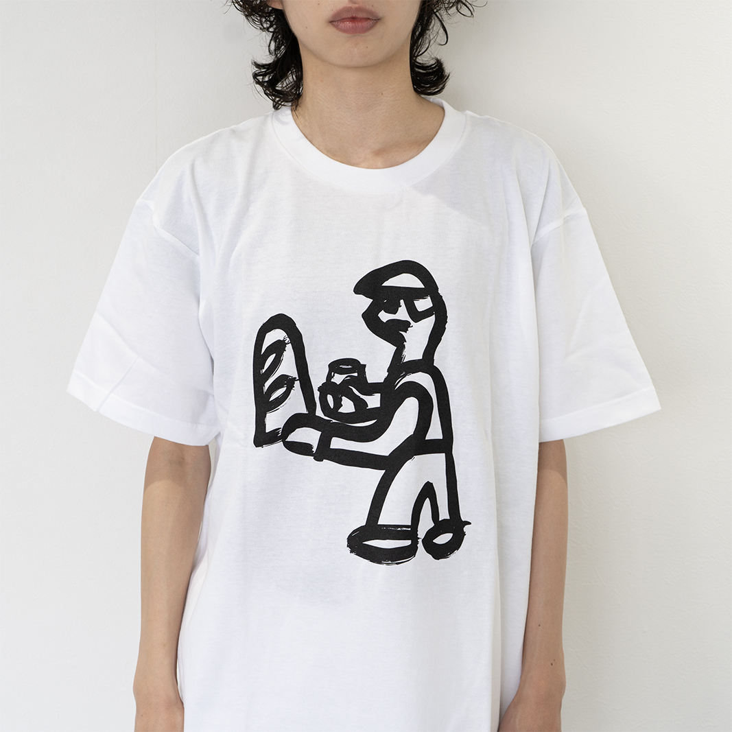
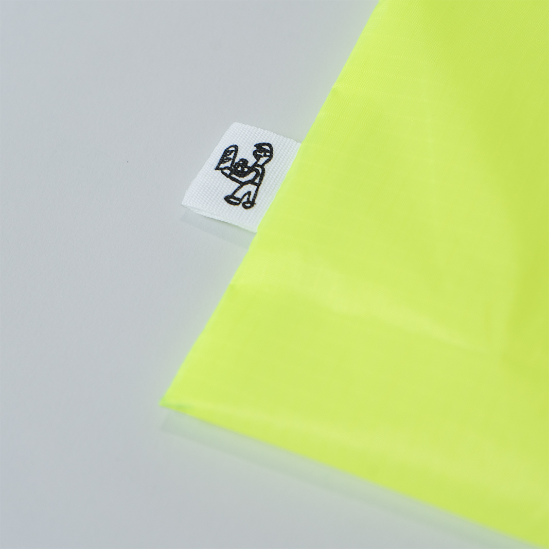
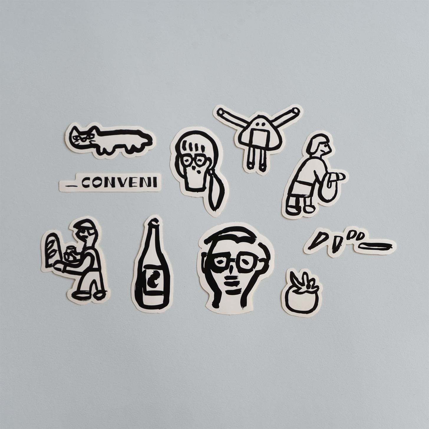
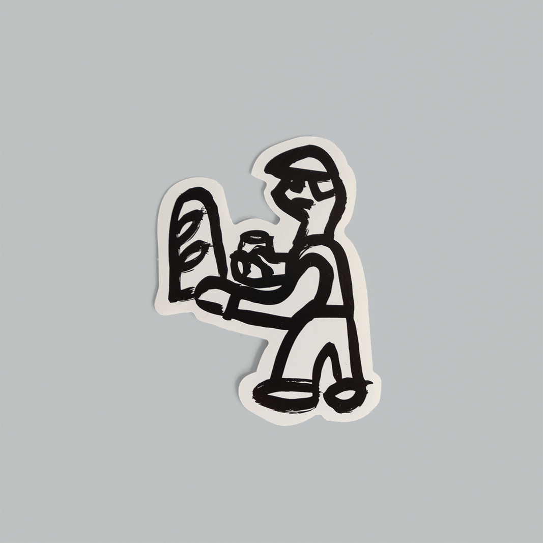
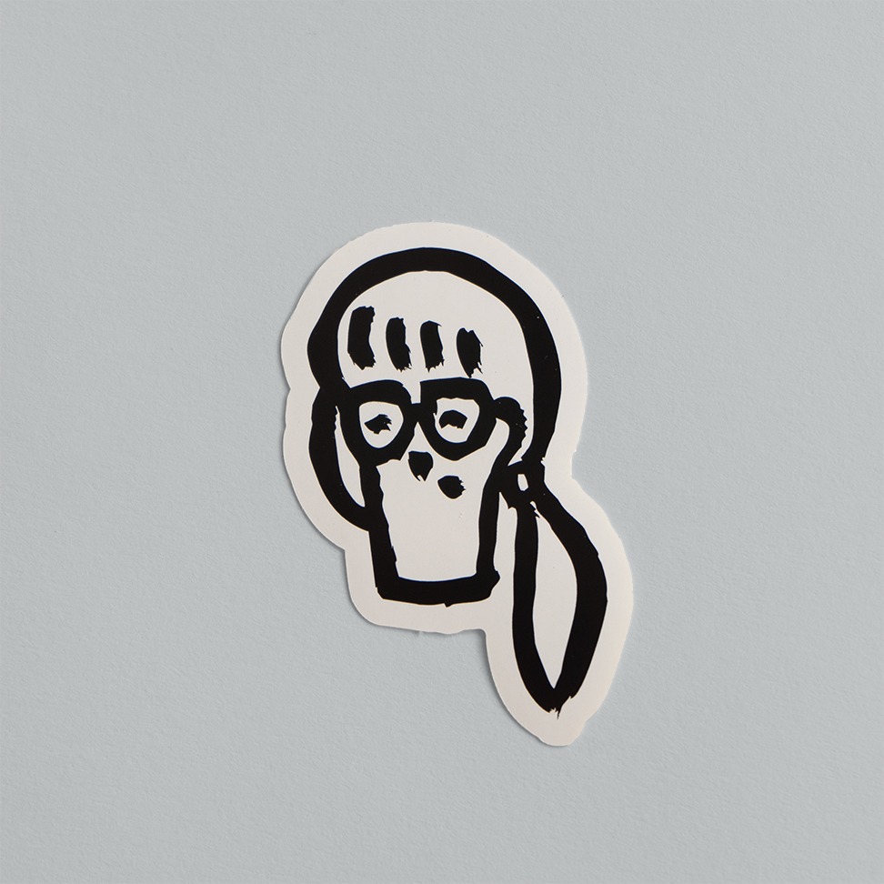
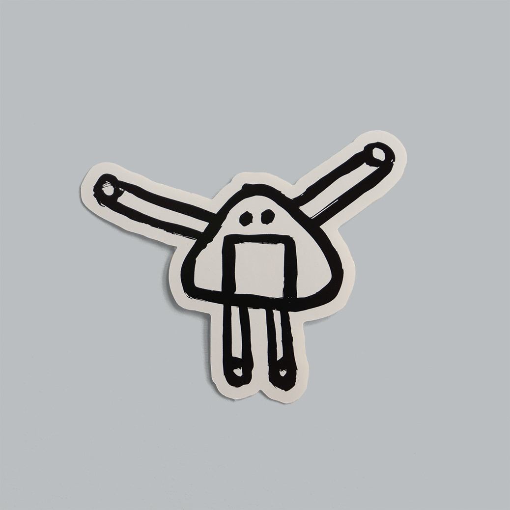
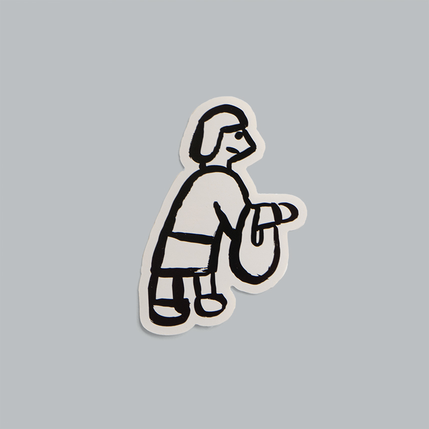
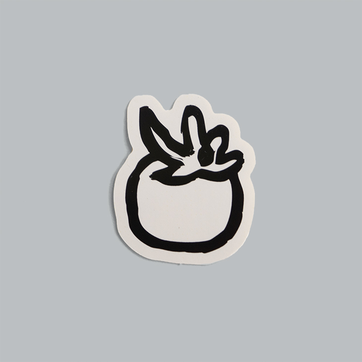
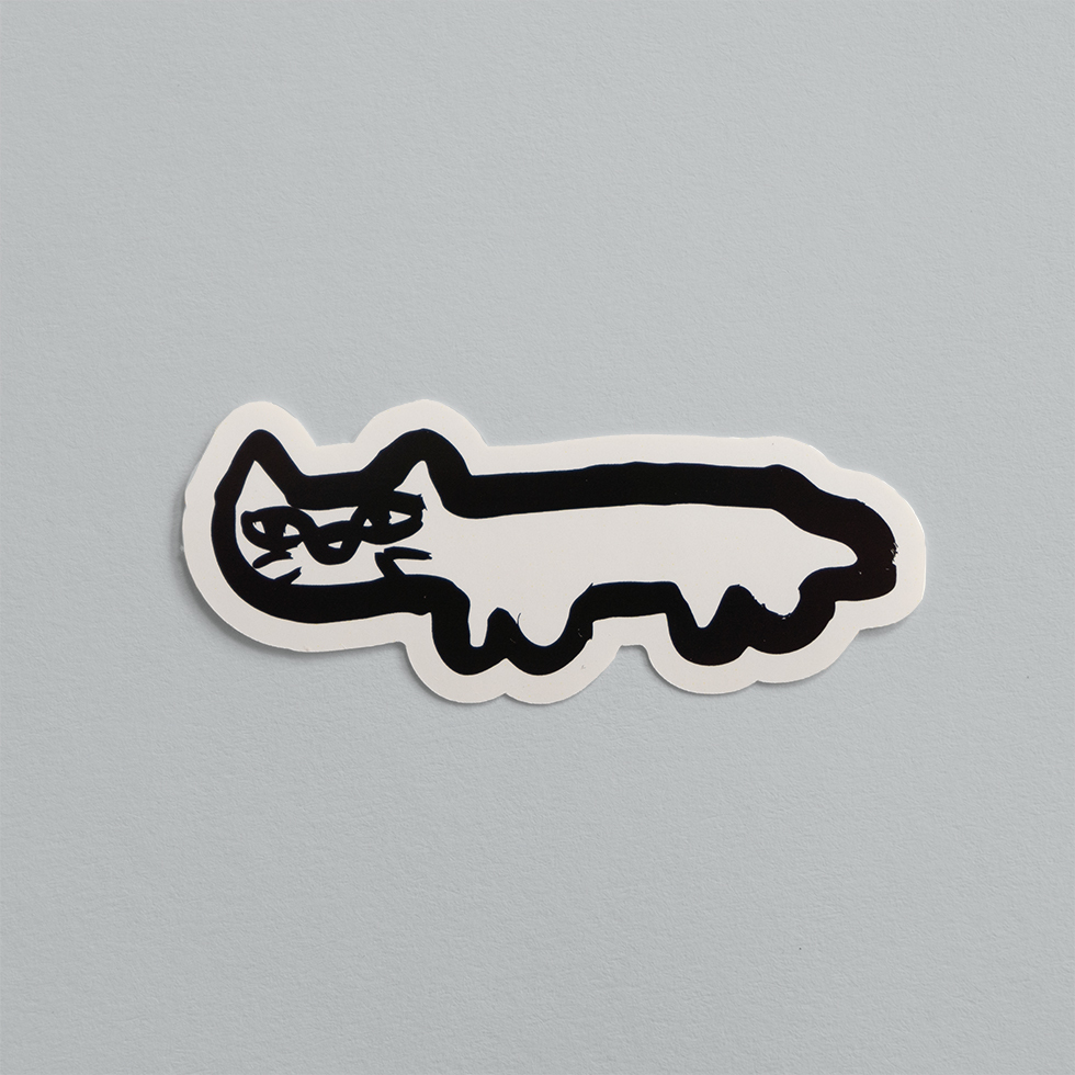
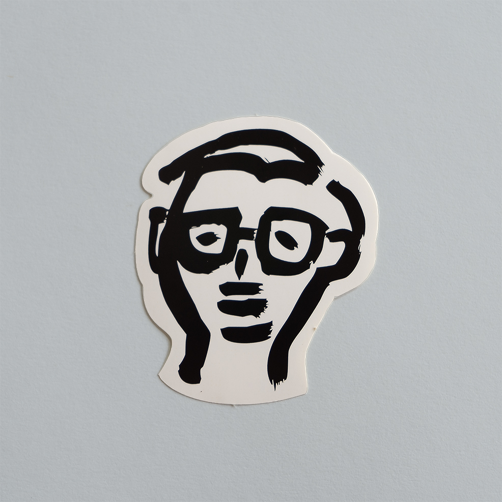
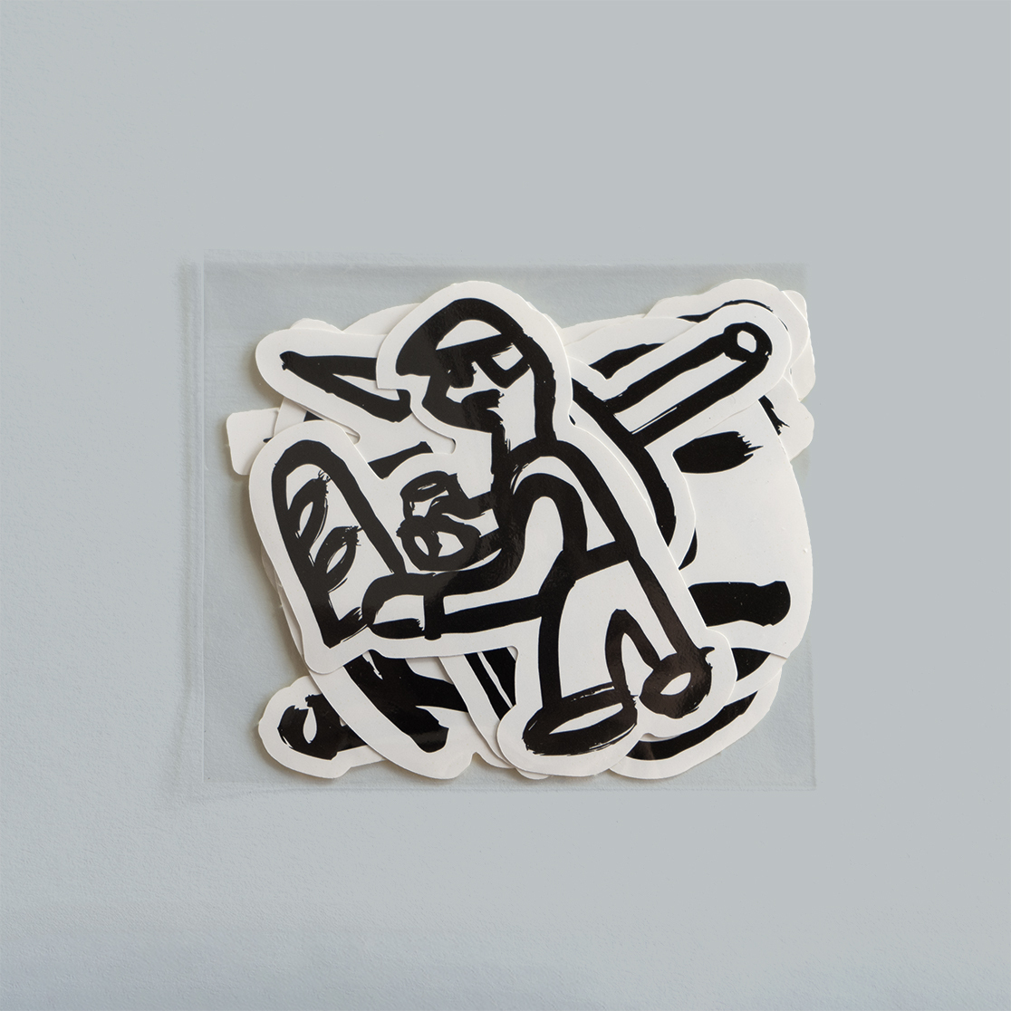
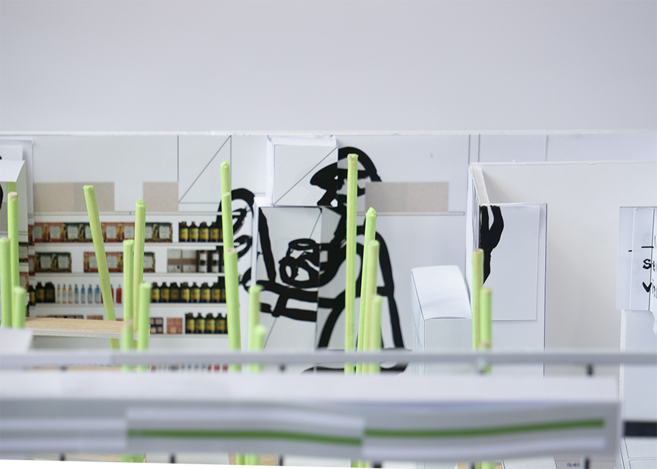
そして、このお店に訪れるであろうお客さん、売られるであろう商品(野菜や飲み物、食べ物)、オーナーである深津さん、お店の店長さんを太い黒の手書きによる線で描いています。
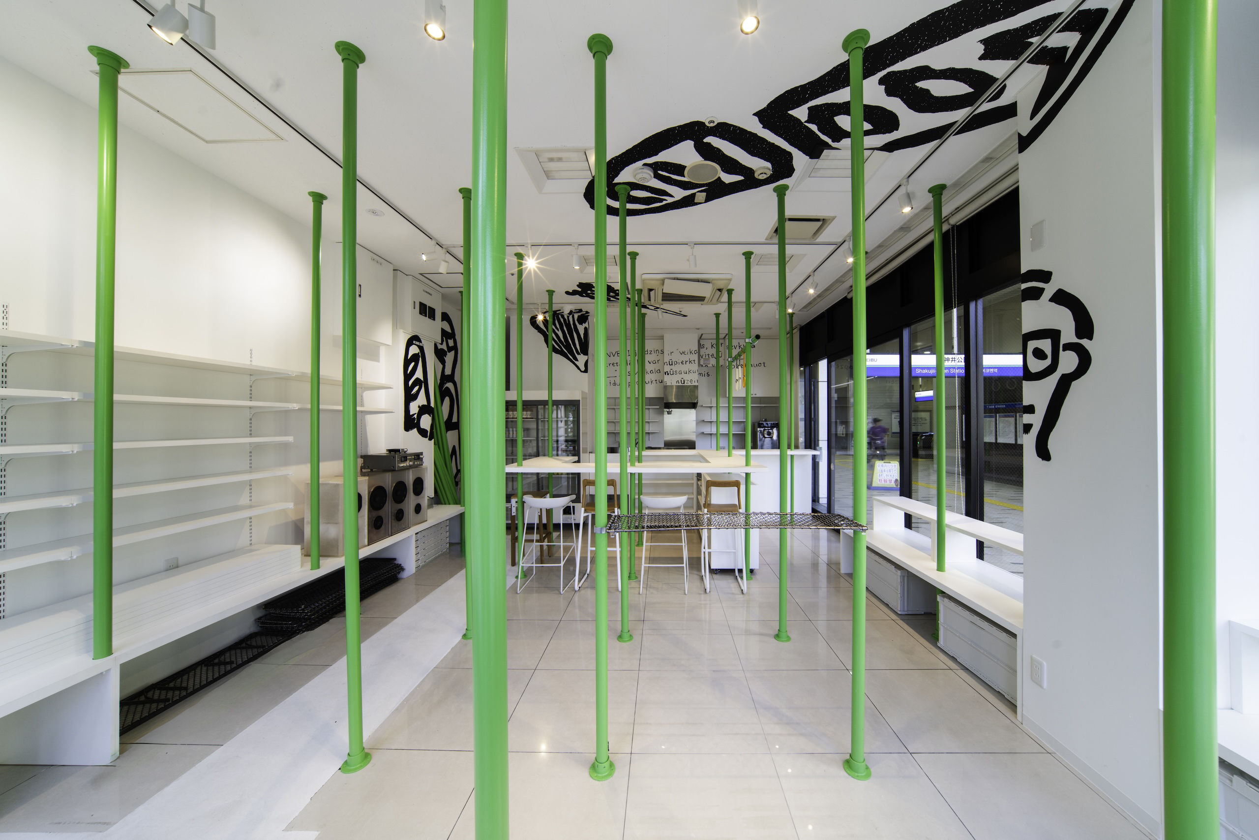
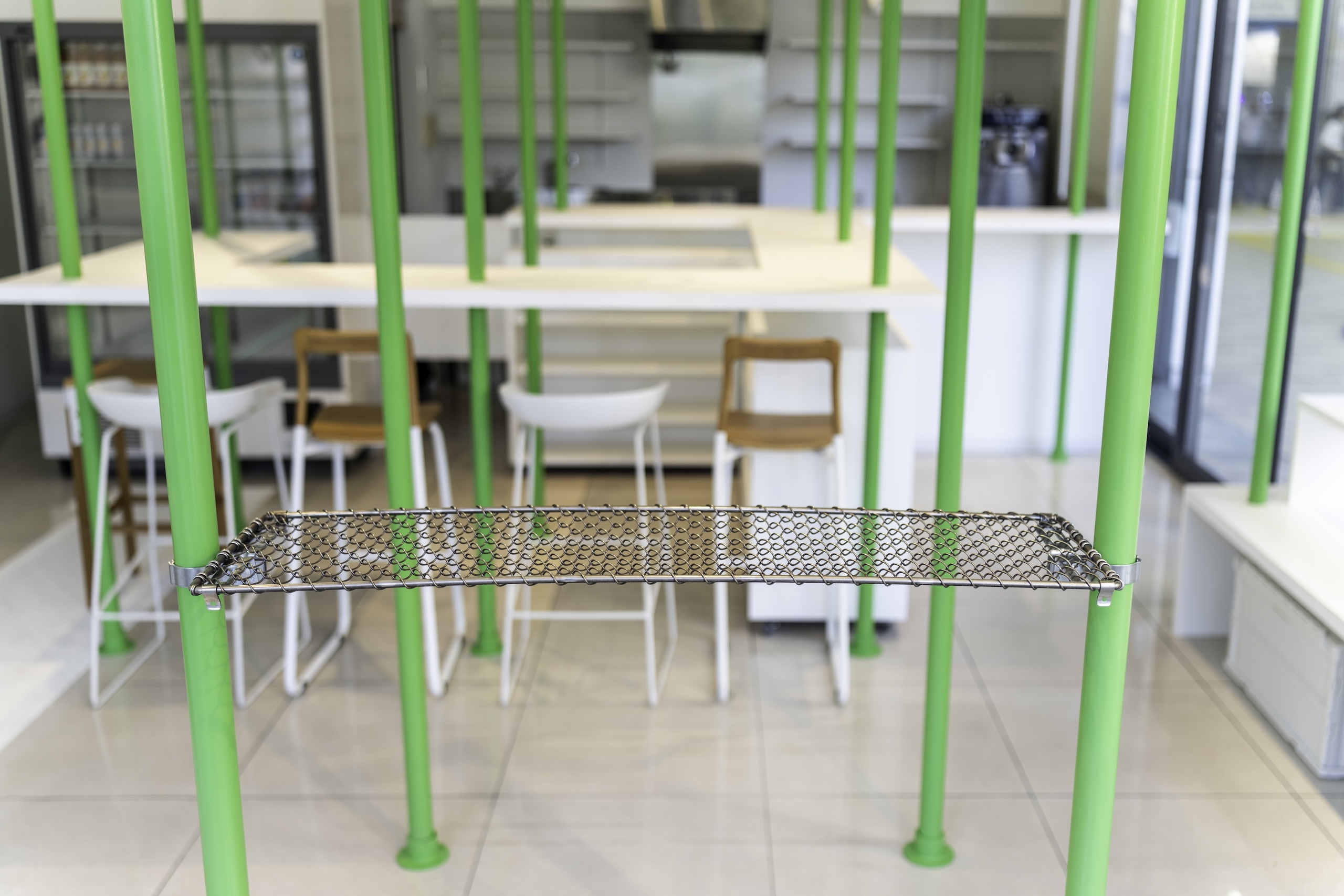
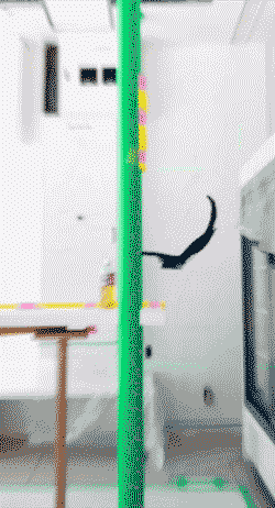
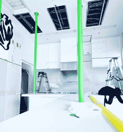
それは、そのまま空間にも関連していきます。蛍光のバー(線)はそのまま、空間の中の単管パイプになり、手書きの黒い線は、そのまま拡大し、手書きで直接壁面、天井に描いています。
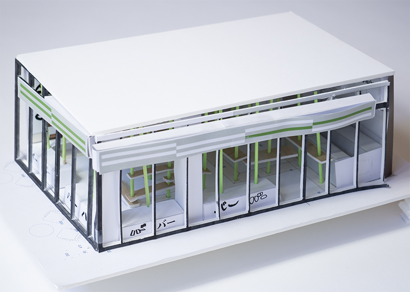
空間のデザインは、模型によりスタディを重ねて、より良いバランスを検討してきました。
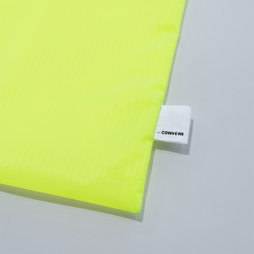
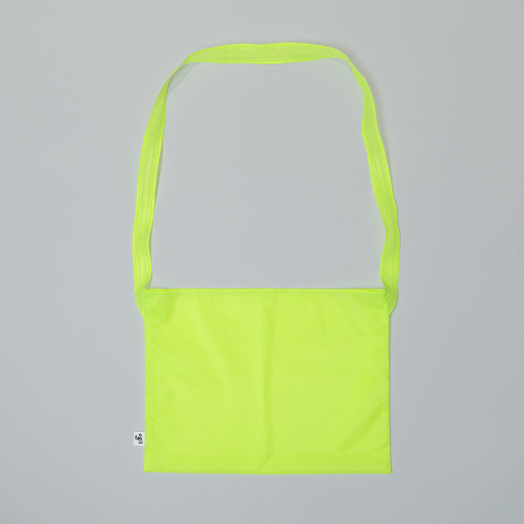
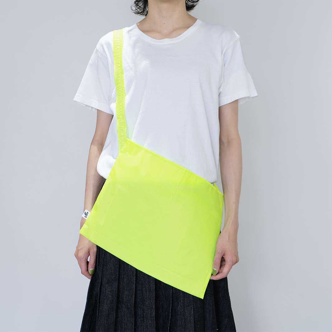
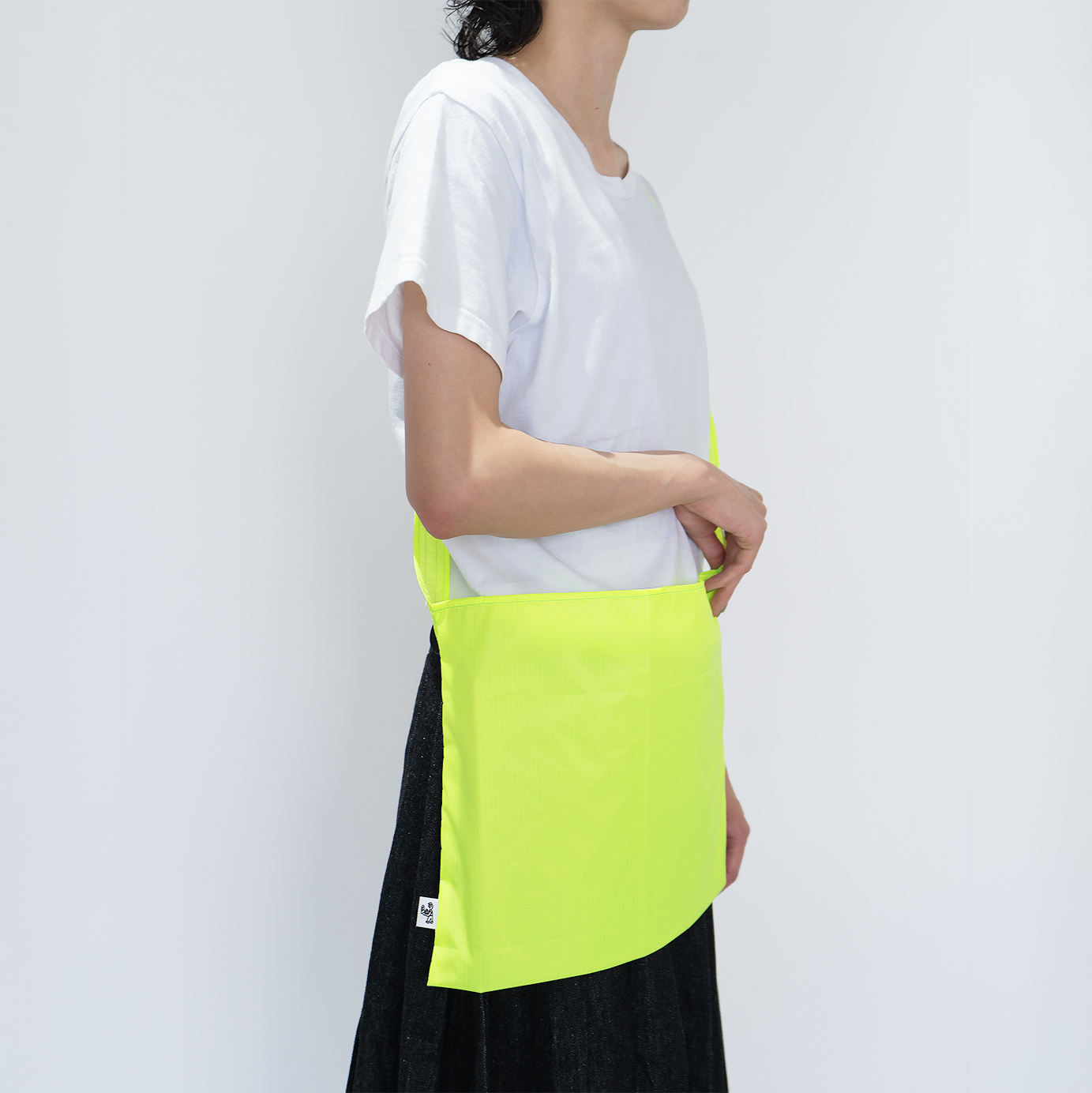
スタッフの方のユニフォームは、蛍光のグリーンの布を元にオリジナルサコッシュ(非売品)を作成しています。肩に掛ける事で、蛍光グリーンのバー(線)が強調される事を考えています。
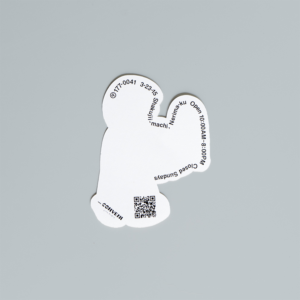
ギフトボックスやエコバック、ステッカーやTシャツなど、オリジナルのグッズも取り揃えていますので、是非、石神井公園駅西口改札へ足を運ばれて頂けると幸いです。
As part of the visual identity for “Bar Convenience,” the concept began with a single fluorescent green bar (line).
This vivid element represents the core design motif, connecting people, products, and space.
The bold black hand-drawn lines depict the individuals who bring this place to life—the customers who visit, the vegetables, drinks, and foods offered, the owner Mr. Fukatsu, and the store manager.
This visual language extends seamlessly into the spatial design.
The fluorescent green bar transforms into steel pipes that define the structure of the interior, while the black hand-drawn lines are enlarged and directly drawn onto walls and ceilings, creating a distinctive and immersive atmosphere.
The spatial composition was refined through multiple model studies to achieve the ideal balance of elements.
The staff uniform features an original sacoche, crafted from fluorescent green fabric. Worn over the shoulder, it enhances and emphasizes the concept of the green bar within the space.
Additionally, the store offers a selection of original merchandise, including gift boxes, eco bags, stickers, and T-shirts.
We warmly invite you to visit the West Exit of Shakujii-Koen Station and experience this unique space firsthand.
クライアント _conveni (バーコンビニ)ノウ株式会社 深津康幸
店舗設計 日神山晃一
デザイン・イラスト担当 平野篤史 岡友紀子